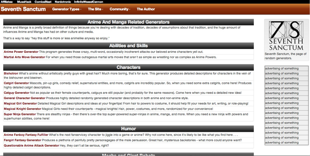
Here’s a look at the latest site design for the generator page. A friend gave some brutally honest feedback on how the overuse of the brass bars was, well EYE WATERING and had some contrast issues. Fortunately it was Bootstrap to the rescue, and I managed to tweak the look in a way that works and seems to be multi-device friendly.

So thoughts?
Steven Savage is a Geek 2.0 writer, speaker, blogger, and job coach. He blogs on careers at http://www.musehack.com/, nerd and geek culture at http://www.nerdcaliber.com/, and does a site of creative tools at http://www.seventhsanctum.com/. He can be reached at https://www.stevensavage.com/.